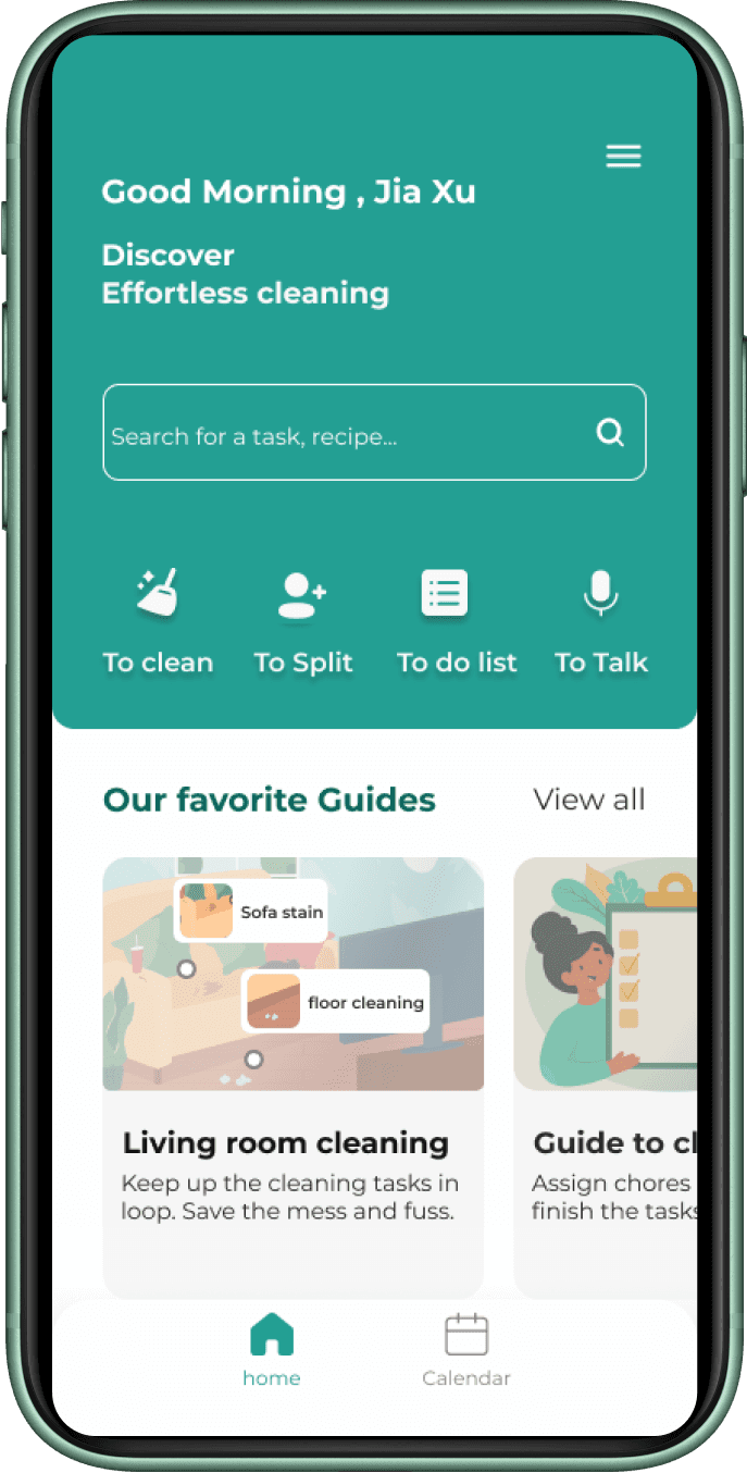
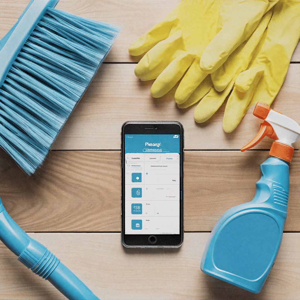
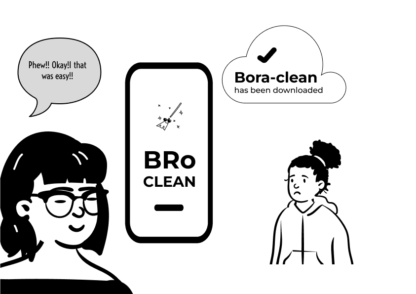
Bro clean
The ultimate AI cleaning assitant
Duration
12th June - 30th August
(12 weeks)
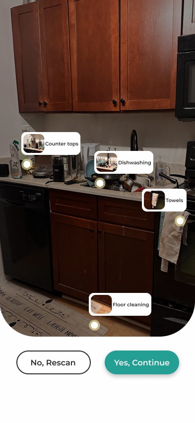
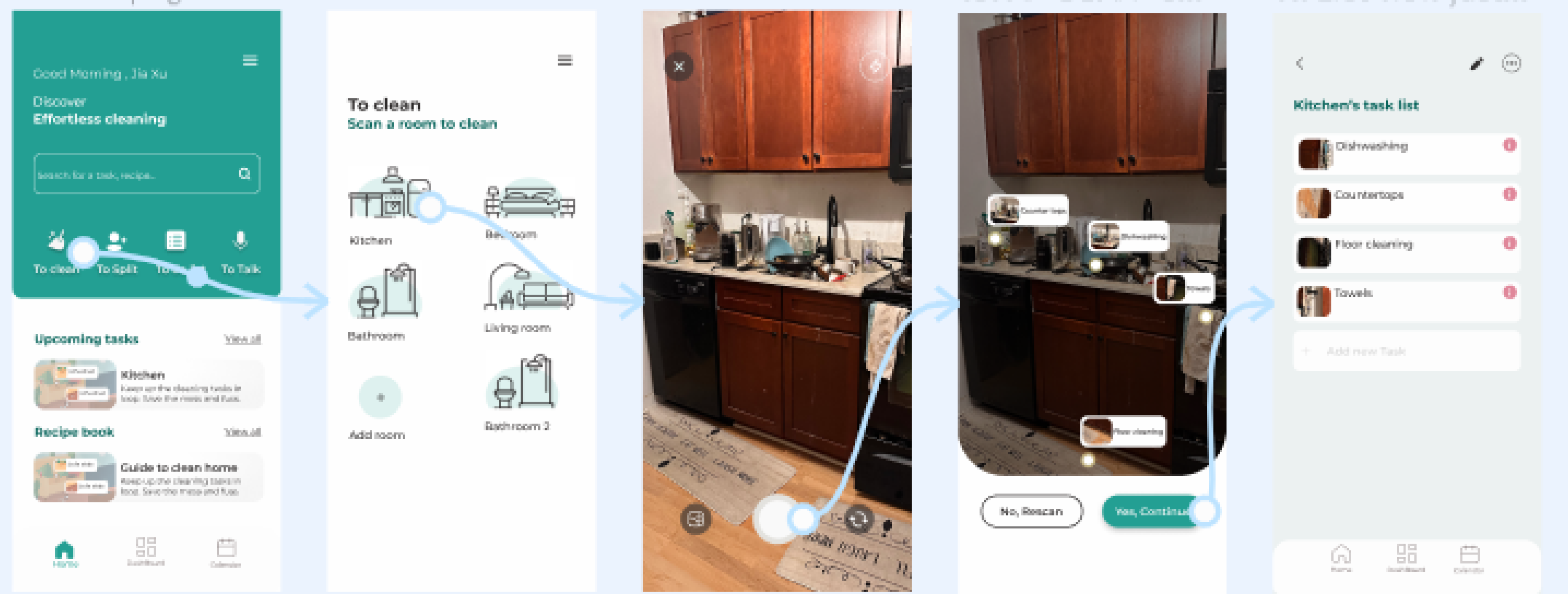
Yes, Continue
No, Rescan

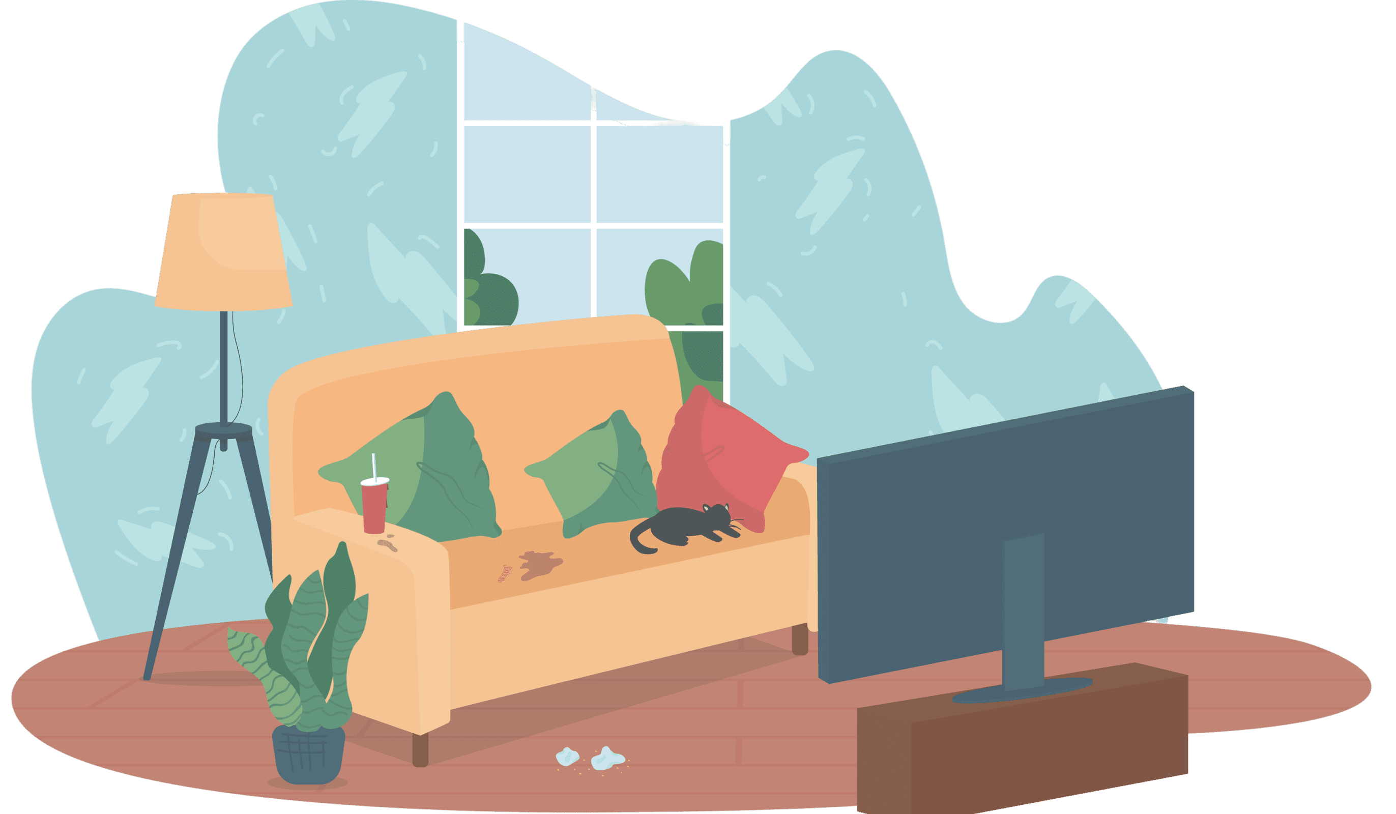
Windows stain

sofa cleaning
Floor cleaning
whiteboard challenge
Embarking on my journey as a UI/UX designer, this project was my first foray into the world of digital design.
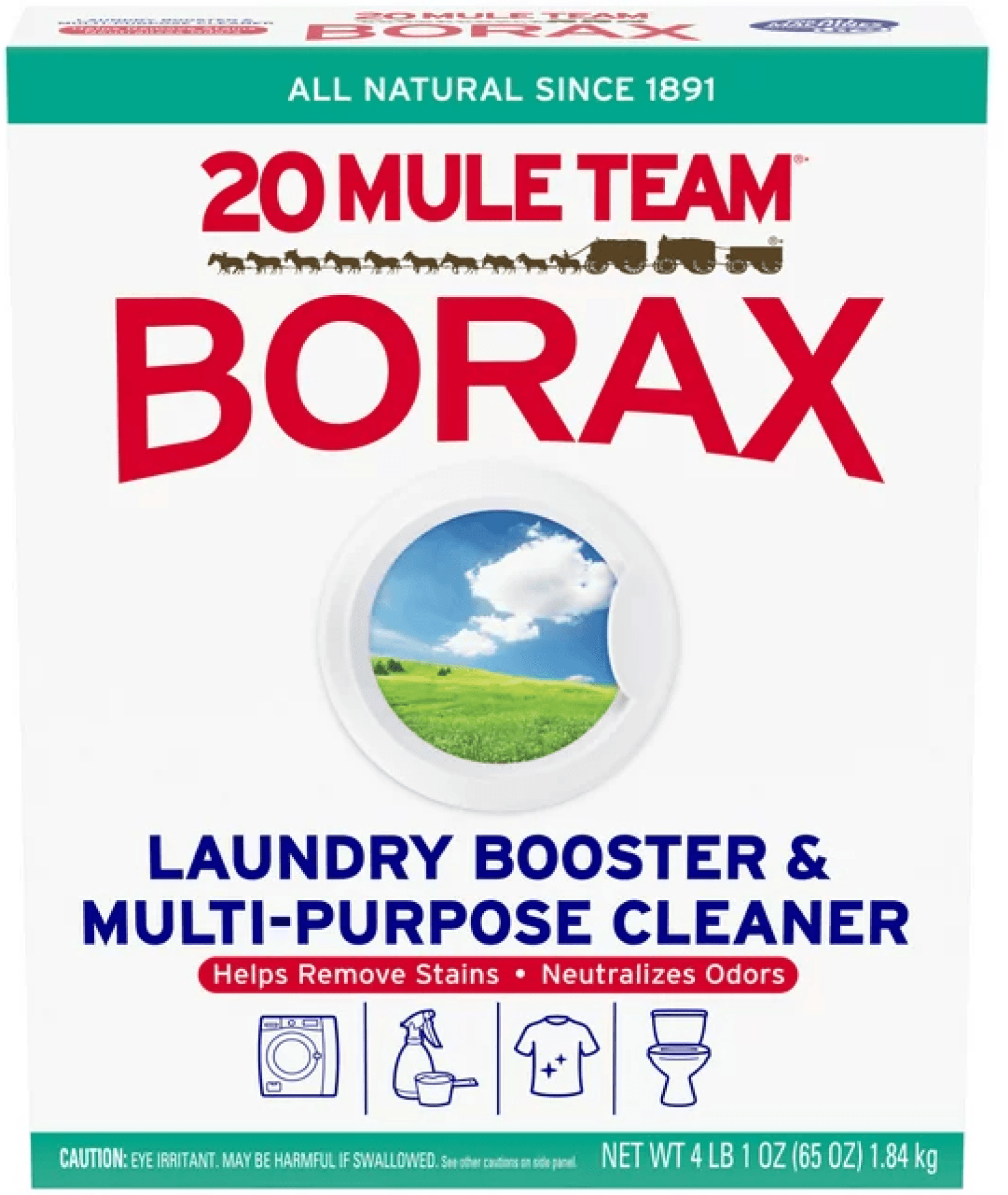
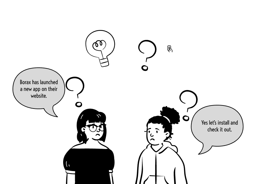
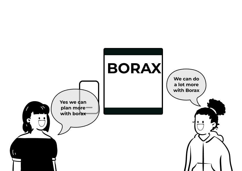
I was tasked with turning a traditional, single-product brand—Borax, a versatile laundry booster and multi-purpose cleaner—into an engaging digital experience.
With no prior e-commerce presence, Borax posed a unique challenge: how could a product so deeply rooted in physical retail translate into a compelling online platform?"
Responsibility
UI Design
Usability Testing
Information Architecture
Tools
Figma
Miro
Problem Statement
Borax, though versatile, had never been part of the digital economy. Traditionally a physical retail product, it faced a major gap in reaching its users online. This project aimed to develop an e-commerce platform while also introducing innovative solutions for shared living spaces—where cleaning routines often fall apart."
KPIs
User Registration
Net sales
KEI’s
Satisfaction score
Subscription rate
Product Overview
The journey from problem to solution began with user research. Through interviews with university students and young professionals, I discovered that many users didn’t realize they were struggling with cleaning routines. Comments like, ‘I didn’t even know what to do with so much leftover Borax, so we trashed it,’ revealed underlying frustrations."
Duration : 3 months
Design Process
Targetted experience to improve dynamics among shared spaces to encourage positivity among community.
Understand
User Research
User Interview
Define
User Personas
Empathy Map
User Journey
Ideate
User Flow
Information Architecture
Test
Feedbacks
Conclusion
Future Concept
Design
Wireframe
Hi-Fi Designs
Prototype
User Base
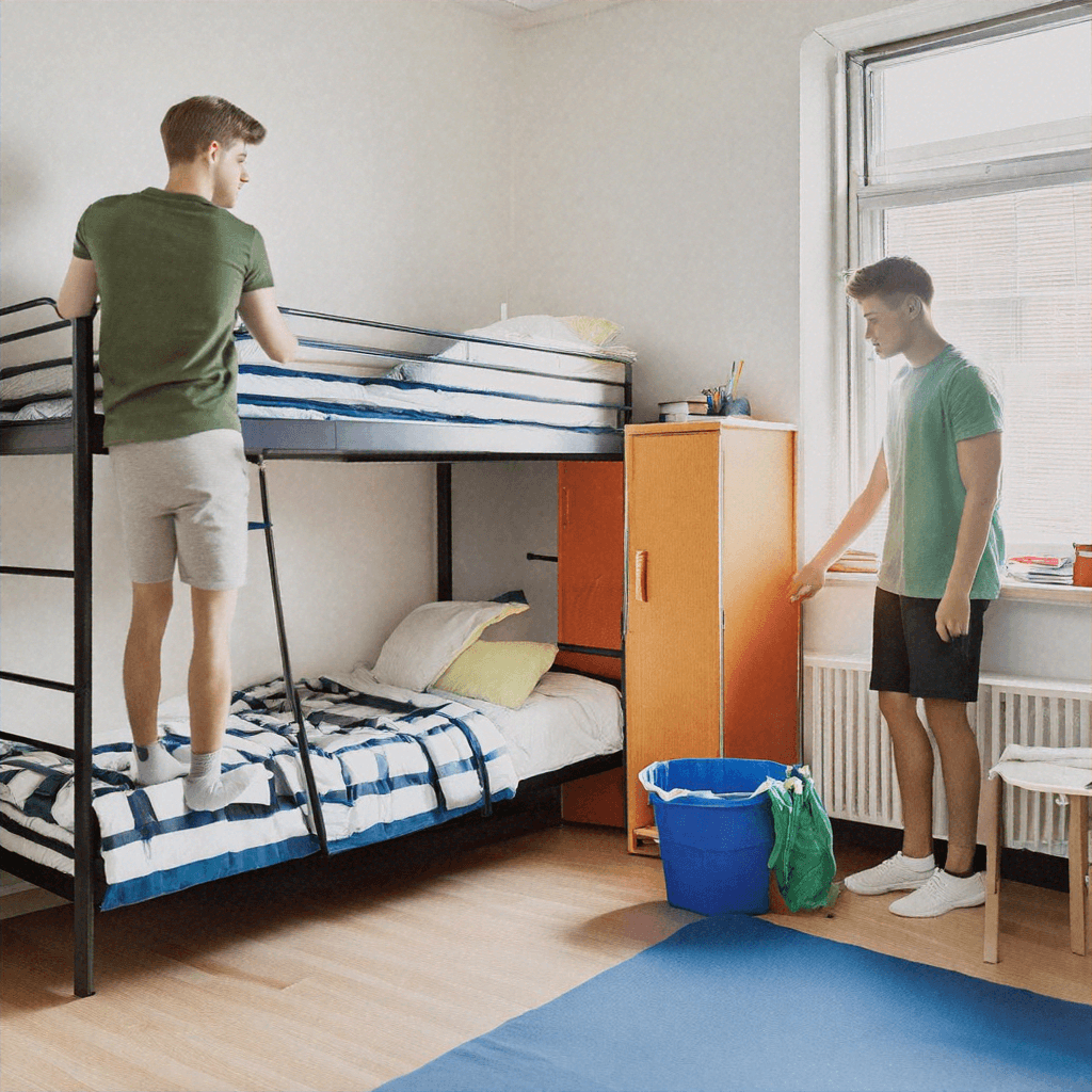
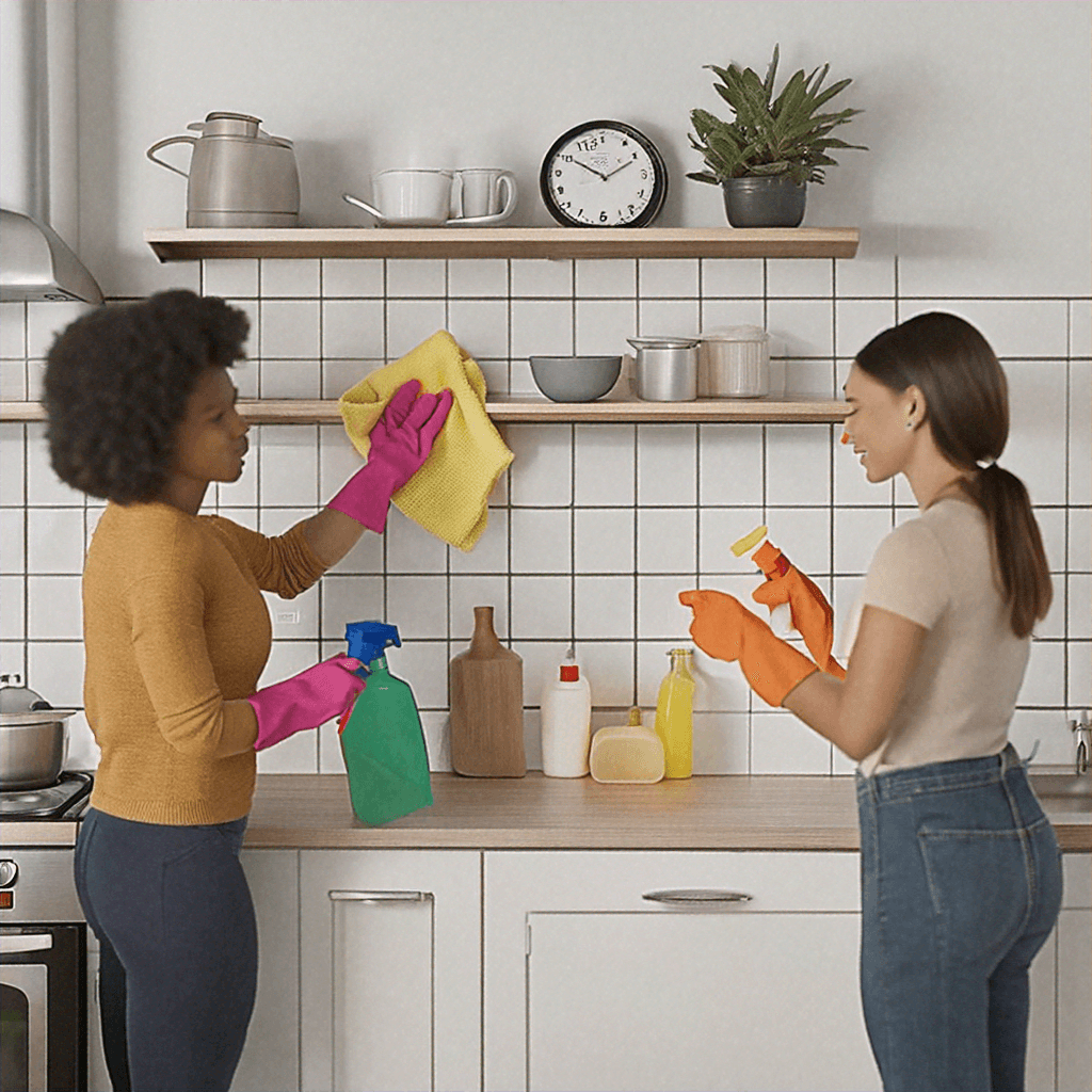
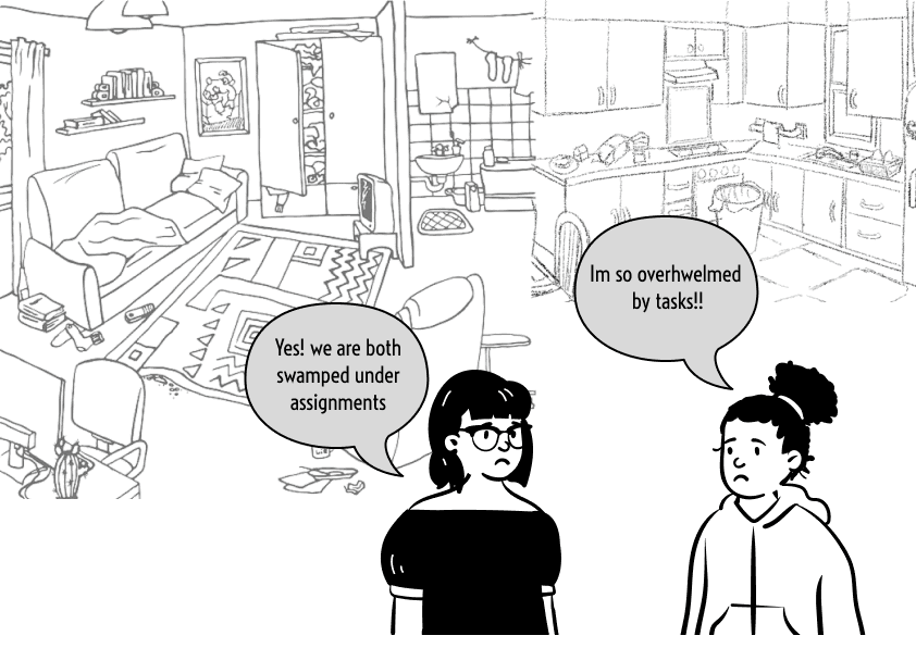
University students and young professionals living in shared spaces formed the core user group. They were often too busy to manage chores effectively and lacked a system to coordinate cleaning with roommates.
User Research
Through interviews, I discovered that while users didn’t explicitly voice frustrations, their behaviors showed an underlying problem with chore management. They needed a solution that was not just a cleaner but a system to help them manage their routines."
You can pair this narrative with user quotes or survey stats, using visuals like bar graphs or pie charts to break up the text.
Competitive Analysis
Company Name
Strong E-commerce
Wide Product Range
Affordable Pricing
Product Versatility
Innovation Potential
Direct-to-Consumer Strategy
OxiClean
Arm & Hammer
Opportunities
Quantitative Research
Why customers are relied on borax primarily , as its easily makes the cleaning process faster removing rust , reducing physical labor , multipurpose , and it’s proven results , really satisfying to watch and remove all the rust, cognitive cleanliness.
Screeners
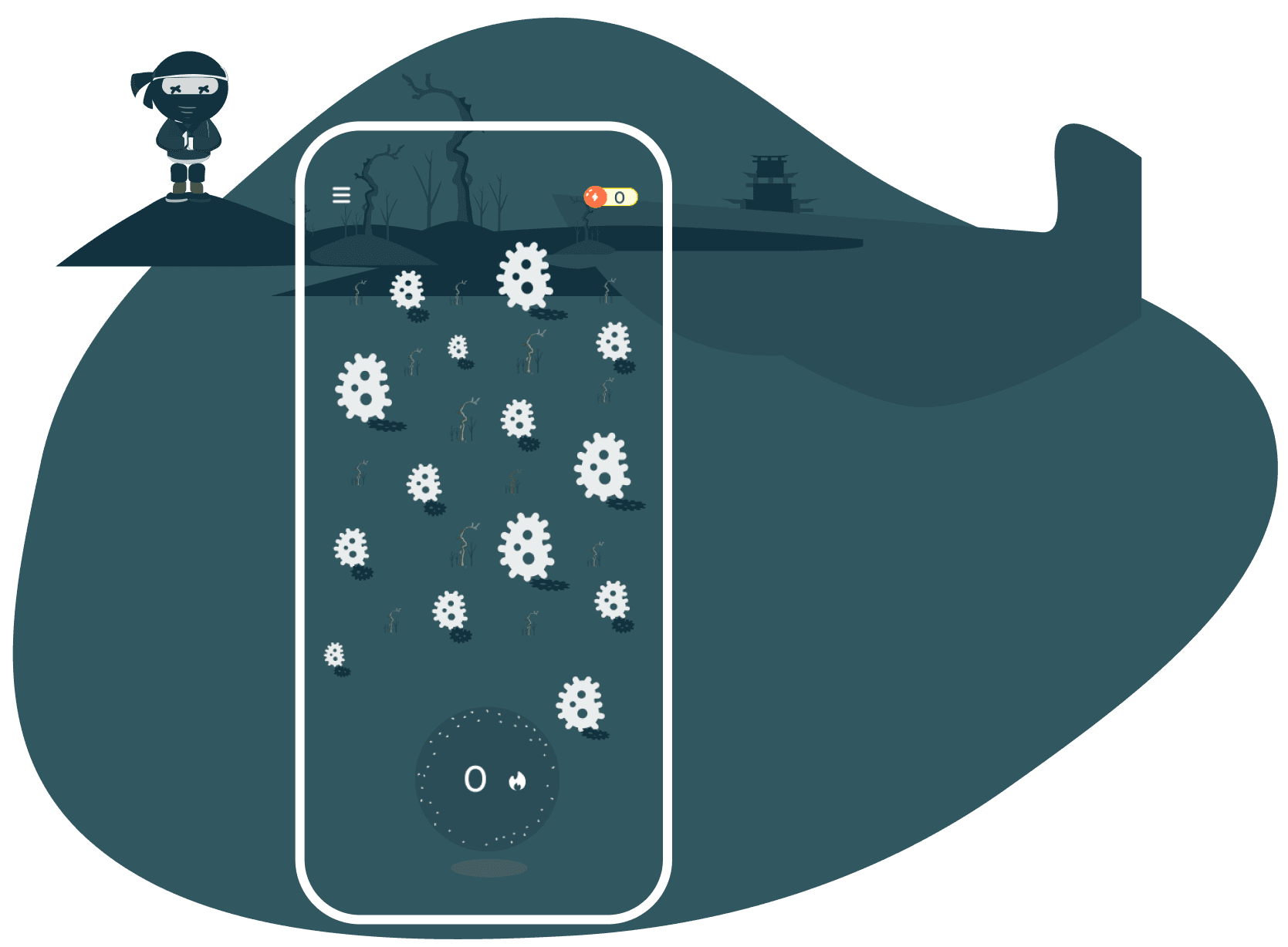
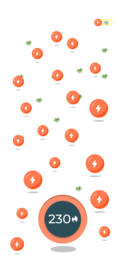
Digital solution:
Bro clean: Multi functional app for roomates living in shared spaces to track the cleaning activity and ease of creating , generating ideas for cleaning.
KPI:
Generating ideas: User doesnt have to spend time in brainstroming what to clean , as borax is a multi purpose cleaner , it has a wide scope while also sending user a message that borax can do a lot more than they think.
Observations
80%
Struggled to clean the house because , they were tired after work.
50%
To stay organized in cleaning and house chores.
80%
Did not know when and where to start cleaning
50%
Did not know how to break tasks into small chunks
80%
To refer to recipes on phone while cleaning.
50%
Struggled to keep an activity about who contributed in keeping the home clean
Unique Features
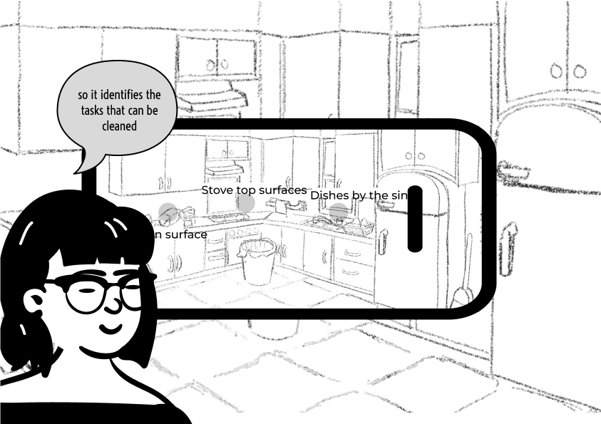
Ai scan to generate ideas for to clean the house.
Splitting Tasks with roomates
How might we make a digital solution more touchless while cleaning and nor reading the recipe over and over again?
To address the pain points, I introduced the innovative AI Scan feature, which helped users identify overlooked cleaning areas in shared spaces. From spotting dust on cabinet doors to forgotten corners in the kitchen, the AI Scan took the guesswork out of cleaning."
User Persona
Bio
Debbie is a working professional going back to school . She lives with three other roomates. She and her roomates lead a very fast paced life. Her job involves alot of hands on work and demands alot of time. She has been using borax for 5 years now for laundry and likes
Personality
Hardworking
Smart
Introvert
Thoughtful
Pain points
Falls back on cleaning.
Forgets to use borax during laundry
Struggles to communicate with her roomates to use Borax
Struggles to track cleaning activity
Tasks are often overhwelming
Goals
To break the tasks
Doesnt know where to start cleaning
To keep the house clean
Walk into the cleaned room after work

NAME:
Debbie
AGE:
35
EDUCATION:
University of Clorado
JOB:
Back to university
LOCATION
Marble , Colorado
HOBBIES:
Hiking , Dancing ,
Going out with freinds
How might we’s?
1.
Pain Point 1
How might we generate ideas , and plan cleaning schedules and keep them in loop?
2.
Pain Point 2
How might we improve community dynamics living in shared spaces to finish the tasks?
3.
Pain Point 3
How might we make a digital solution more touchless while cleaning and nor reading the recipe over and over again?
Empathy Map
Does
Communicating and leaving notes on the fridge.
Forgets Using borax along with detergent and laundry booster.
Snoozing reminders often due to tight schedules.
Forgetting which part of house is to be cleaned.
Feels
She does’nt memorize
Not contributing enough to shared spaces
She could be better organized
Should be better at time management
Story Board
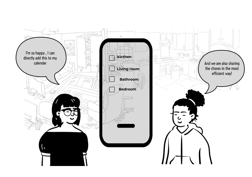
Information Architecture/User Flow
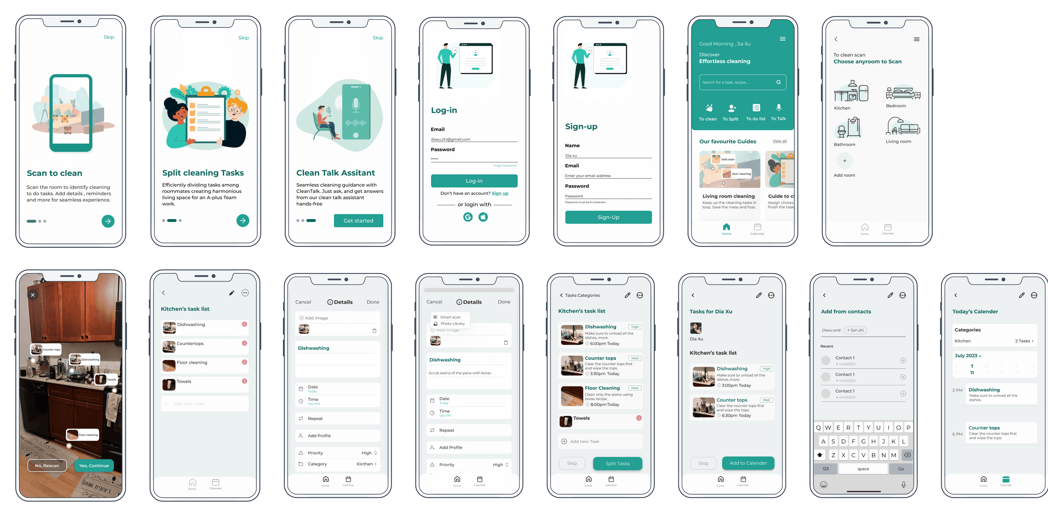
Onboarding Screens
Home Screen
Splash Screen
To clean
Scan the rooms
Choose a room
Suggested Task
Assign Tasks
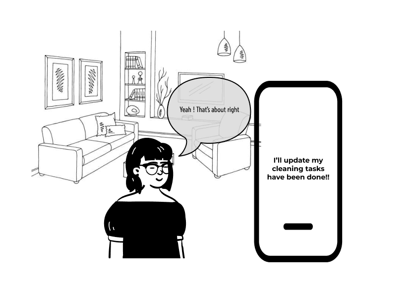
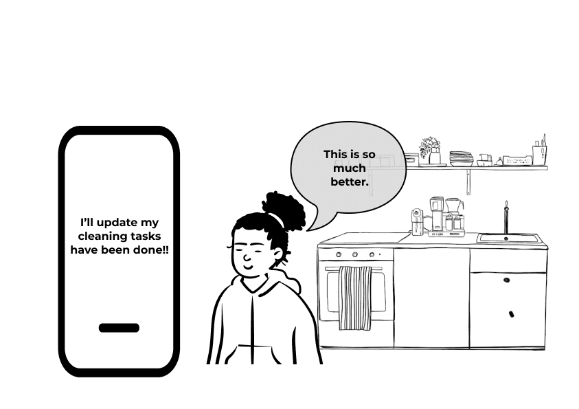
Complete Task
View Tasks
To do list
To talk
Voice Command
Create Task
Add Details
Confirm task
Start
Split tasks
Add Profile
View task Progress
Add to Calender
Task Complete
Calender
Add to calender
Set Reminder
View deadlines
Mark as complete
Style Guide
Color Palette
Primary Color
239F93
Shades
Shades
tertiary supporting colors
Typography
Aa
Font
Montserrat
Aa
Montserrat
Bold
Aa
Montserrat
Semibold
Aa
Montserrat
Medium
Aa
Montserrat
Regular
Text Style
Font Size
Line weight
Line Height
Display
Heading large
Heading Medium
Label large
Label Medium
Label Smal
Body Medium
Body Small - Regular- 16px
Body X Small - Regular- 12px
Button link
Button Text
Button CTA
30 Px
20 Px
18 px
16 Px
16 Px
10 Px
16 px
16 px
16 px
16 px
18px
20px
BOLD
Bold
BOLD
semibold
Medium
Regular
medium-
medium-
medium-
Bold
Regular
Medium
36 px
28 px
24 px
24 px
22 px
16 px
24 px
24 px
24 px
24 px
24 px
24 px
Iconography
Outline
Solid
Small
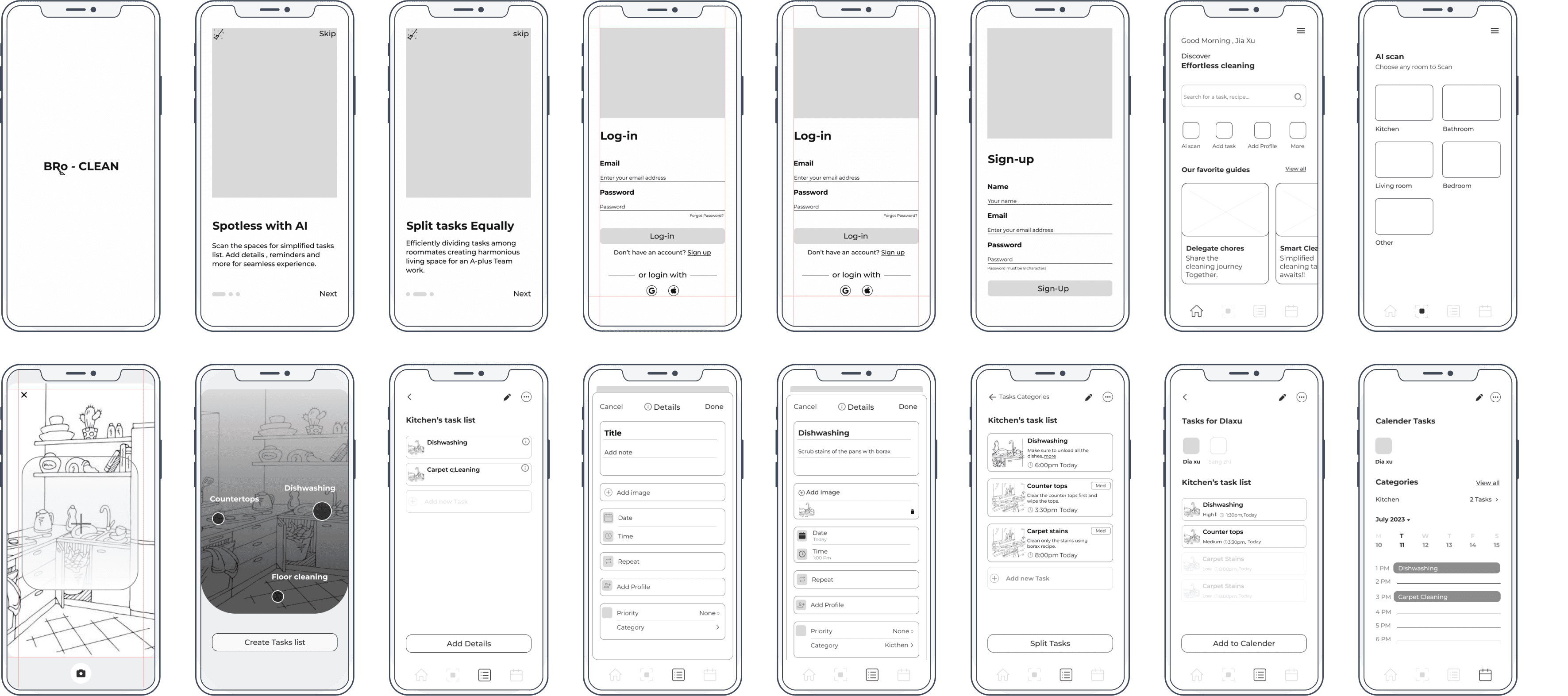
Sketches/Low-fidelity Wireframes
Wireframes
Key Takeaways
The primary goal is to ensure that users, whether first-time or returning, are encouraged to engage with key features and efficiently navigate the app.
90%
Ease of creating task
70%
Exploring the full potential of the app rather than not creating the tasks at all.
80%
Cleaning task creation from start to end- user flow is simplifies less number of Tasks
100%
Task completion in creating the tasks
Final Prototype
Next steps
As this project was a whiteboard challenge, the next steps would focus on refining the initial concepts and ensuring the design aligns with user needs. Future phases would involve conducting usability testing with a broader audience, including families, roommates, and students, to collect diverse feedback on the proposed solution. Insights from these sessions would help identify areas where task management features can be optimized or where visual design adjustments may improve accessibility and ease of use.
In parallel, refining the information architecture would be essential to ensure smooth navigation and a user-friendly experience. By addressing edge cases, such as users managing multiple shared spaces, the app can cater to a wider range of scenarios. Testing mock data for task assignments, reminders, and progress tracking would allow for further validation of the design, simulating real-world interactions and uncovering potential gaps in functionality.
Finally, all findings, refined designs, and user insights would be consolidated into a comprehensive document to guide future iterations. This phase would focus on presenting the solution in a way that highlights its practicality and usability, ensuring it is ready for development and further testing.
Next projects